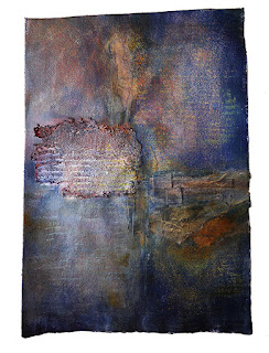
it was ok,but wishy washy and the shape stood dominant bcse of scale and texture.the design problem faced was integrating the shape to the background which on the other hand had not enough variety.
paynes grey all over; dark and gloomy, like the week that was.
better but the shape still stood out dominant also the dark framing drew too much attention towards it..now the small squares were competing for attention.
better but the shape still stood out dominant also the dark framing drew too much attention towards it..now the small squares were competing for attention.
covered the small squares with some torn tissue paper and added more under them .nickel azo gold you rock!

added washi to the top center and to the small squares to soften them. as an aside, have you tried to tear washi?
ripped some of the edges of the textured square and wiped off some of the dark framing, softening it. totally addicted to alcohol erasing!
i think it needs some more work, but one has to learn when to say: enough, lets move on.
neki desu


welcome back, can't imagine the frustration of website changes. Would like to do the same thing myself but might just give up and never return. Like this piece, very moody. Think the secret to creating is knowing when to STOP.
ReplyDeleteI think you stopped at exactly the right place. Not too much, not to little. I love the final version!
ReplyDelete