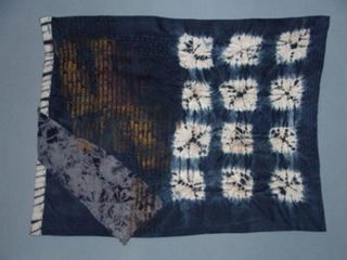
 This is the latest of the kana series.I really wanted shibori visual texture in those orderly white squares so that they would somewhat visually pick up the shibori border pipping and the scrunch dyed bit.
The challenge was to bring it all toghether without making it too busy. Cohesive not busy.

Here's a close up of some of the resources used.The kana here is blurred because here it was less about reading. In the end I also decided against ironing the squares flat.
neki desu
Tags:
No comments:
Post a Comment
interaction appreciated!