Translate

Thursday, June 30, 2016

whoa! woe!


lesson four was about creating pattern repeats.
trying to avoid the circle visual cliche and here i go! one can easily find stuff around the house to print with. problem is that round or circular things abound.mea culpa.


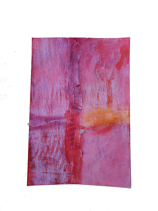
busy.but i like the rauschenberguesque look/ feel.
and i know you love the made up adjective.(*▽*)


different stages of completion.the flowery one's outside the assignment, but what the hell.
however today's market day aka 
grocery shopping. not too much is 
going to be accomplished in the studio.

wish i could be zen and minimalistic.


neki desu
Creative Commons License

Wednesday, June 29, 2016

about contrast

'nother  take from lesson 3. background lacking variety and contrast, but not entirely blah. how's that for artspeak.


more gloom enters the scene. tough week last one
and that's an understatement.i have mixed feelings about the heaviness, but do think the glooms work.


pretty chuffed with this one. like those red spots on the left!
i think they work.
trying to avoid the visual cliche of bubble wrap, but waste sequin comes second to it  :(
 have some more exercises that i could post, but i want to start the next lesson.

hate those blogger borders. the first photo looks so very odd in respect to the title. cant find the code to eliminate it.she said after 2 weeks working with codes.


neki desu
Creative Commons License

Tuesday, June 28, 2016

on process and post prod


it was ok,but wishy washy and the shape stood dominant bcse of scale and texture.the design problem faced was integrating the shape to the background which on the other hand had not enough variety.


paynes grey all over; dark and gloomy, like the week that was.
better but the shape still stood out dominant also the dark framing drew too much attention towards it..now the small squares were competing for attention.

covered the small squares with some torn tissue paper and added more under them .nickel azo gold you rock!


added washi to the top  center and to the small squares to soften them.  as an aside, have you tried to tear washi?
ripped some of the edges of the textured square and wiped off some of the dark framing, softening it. totally addicted to  alcohol erasing!
 i think it needs some more work, but one has to learn when to say: enough, lets move on.


neki desu
Creative Commons License

LinkWithin

Related Posts Plugin for WordPress, Blogger...